Want to create lead forms that actually work? Here's what successful companies are doing to boost their conversion rates.
These 15 real-world examples show exactly how to turn website visitors into leads:
- HubSpot - Simple contact form with smart fields
- Intercom - Chat-style form that feels personal
- KlientBoost - Clean layout with "Breadcrumb Technique"
- Lemonade - Step-by-step insurance signup
- StitchFix - Interactive style quiz
- Blue Apron - Meal planning wizard
- Blume - User-first wellness forms
- Overstockart - AI-powered art finder
- Thrillist - Interest-based content form
- Dropbox - Business conversion form
- CrazyEgg - One-field free trial signup
- Content and Marketing - Tool search form
- LeadFormly - Dynamic smart fields
- OddBalls - Gamified form design
- ClickMechanic - Car service booking
What makes these forms work? They:
- Keep questions minimal (3-5 fields max)
- Break long forms into steps
- Show clear progress
- Work perfectly on mobile
- Give instant feedback
- Build trust with social proof
Key numbers worth knowing:
- Cutting form fields from 4 to 3 can boost conversions by 50%
- Forms above the fold get 84% more attention
- Multi-step forms convert 47% better than single page
| Form Type | Best For | Typical Conversion Rate |
|---|---|---|
| Single page | Simple signups | 4-5% |
| Multi-step | Complex services | 13-15% |
| Chat-style | Engagement | 10-12% |
| Quiz format | Product matching | 15-20% |
Related video from YouTube
What Makes a Good Lead Form
A good lead form is key for effective lead generation. It's not just about getting info - it's about making it easy for visitors to become leads. Let's look at what makes a lead form work well.
Keep It Simple
The #1 rule? Keep it simple. Cut your form fields from four to three, and you might see 50% more conversions. That's huge! It shows how important it is to keep forms short and focused.
Must-Have Elements
A form that converts well usually has:
- A headline that shows clear value
- Few form fields (3-5 is ideal)
- Clear, short labels for each field
- A big, action-focused submit button
- Trust builders like privacy policies or security badges
Smart Placement
Where you put your form matters. Studies show people pay 84% more attention to stuff above the fold. So, put your form where people see it right away.
Mobile-Friendly
Most people browse on phones now. Make sure your form works well on mobile:
- Use a single column layout
- Make input fields easy to tap
- Use big buttons for fat fingers
Build Trust
People worry about their data. KPMG found 68% of users are concerned about how much data businesses collect. To help with this:
- Have a clear, short privacy policy
- Show off happy customer quotes
- Use security features like CAPTCHA (but don't overdo it)
Get Personal
Personalizing forms can boost conversions. HubSpot asks first-time visitors for extra info to qualify leads better. This fits with "progressive profiling" - getting more details over time without overwhelming people at first.
Try New Things
Some companies are getting creative:
LeadsHook uses decision trees that feel like a conversation, qualifying leads through automated, personalized chats.
BrokerNotes uses toggle sliders and minimal text, making the process less stressful and showing relevant questions based on previous answers.
These new ideas show that lead forms can be both useful and engaging.
Don't Forget to Follow Up
A good lead form doesn't stop when someone hits submit. Send an automatic email right after to keep the conversation going. This quick follow-up can set expectations and give extra value, helping to nurture the lead.
Key Rules for Forms That Work
Want forms that actually convert? It's not just about asking for info. It's about creating an experience that makes people want to fill it out. Let's break down some rules that'll supercharge your form's performance.
Cut the Fluff
Here's the deal: keep it simple. Expedia learned this the hard way. They axed one field - "Company" - from their booking form. The result? A cool $12 million more in yearly profit. Crazy, right? It just shows that every single field counts.
Top of the Page, Top of Mind
Where you put your form matters. A lot. Nielsen Norman Group found that people pay way less attention to stuff below the fold. So, stick your form where it's impossible to miss. You'll grab those eyeballs right from the start.
Think Small Screens First
Over half of all web traffic comes from mobile now. So, if your form isn't mobile-friendly, you're in trouble. Here's what to do:
- One column layout. Easy to scroll.
- Big buttons and fields. Aim for 48x48 pixels minimum.
- Use auto-fill. Less typing = happy users.
Smart Field Design
How you set up your fields can make or break the user experience:
- Labels above fields. Easier to read.
- Real-time validation. Let users know if they're doing it right.
- Mark required fields. A simple asterisk (*) does the trick.
Show Progress on Long Forms
Got a longer form? Break it into steps. Autoglass does this well. They use a progress bar to show users how far they've come and what's left. It's like a little game - people want to finish what they've started.
Build Trust
KPMG says 68% of users worry about how much data businesses collect. Here's how to ease their minds:
- Clear, short privacy policy.
- Security badges. Show them you're legit.
- Testimonials near the submit button. Social proof works wonders.
Nail Your CTA
Your call-to-action button is the final boss. Make it unbeatable:
- Action words. "Get My Free Guide" beats "Submit" any day.
- Make it pop. Use colors that stand out.
- Big enough to tap. On all devices.
Never Stop Improving
Form optimization isn't a "set it and forget it" deal. Keep testing different elements. Button color, field order, you name it. Find what clicks with your audience.
1. HubSpot's Simple Contact Form
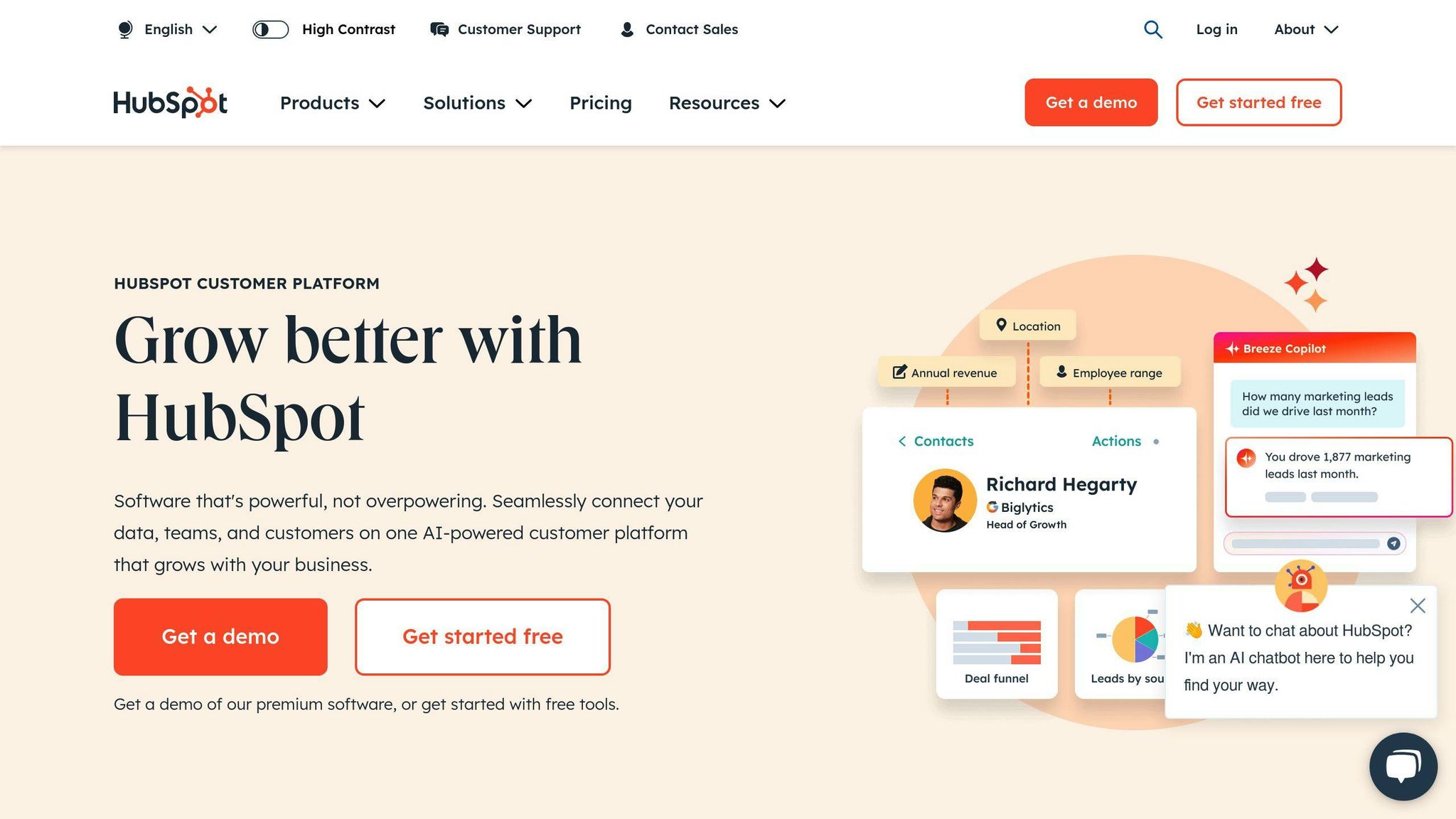
HubSpot's contact form shows how keeping things simple can boost conversions. They've nailed the balance between getting key info and making it easy for users.
The form looks clean and tidy. It's just one column, so you can zip through it quickly. This works great on phones too - no awkward side-scrolling needed.
HubSpot's got a neat trick up its sleeve: smart fields. Here's what they say about it:
"We only show these extra fields to first-time visitors."
Smart, right? New leads give more details, while regulars don't have to repeat themselves. It's a win for everyone.
They've also picked their questions carefully. It's not an interrogation, but they still get enough info to sort their leads. It's like Goldilocks - not too much, not too little, but just right.
Let's break down what makes their form tick:
| What | Why it works |
|---|---|
| Clear labels | You know exactly what to put in each box |
| Must-fill fields | Marked with * so you can't miss them |
| Big submit button | Stands out and tells you what'll happen |
| Extra info | Gives you a hint if you're not sure what to write |
The form fits right in with HubSpot's look. It's easy on the eyes with plenty of white space and a nice, clear font.
While we don't know the exact numbers, HubSpot keeps using this form. That's a pretty good sign it's doing its job.
Want to make your form better? Here's what you can learn from HubSpot:
1. Keep it simple: Ask only what you really need to know. Every extra question might make someone give up.
2. Use smart fields: If you need more info, try getting it bit by bit instead of all at once.
3. Think mobile: Make sure your form works well on phones. One column usually does the trick.
4. Clear next steps: Use action words on your submit button. "Get Started" beats "Submit" any day.
5. Look good: Make your form match your brand. It should feel like part of your site, not an afterthought.
2. Intercom's Chat-Style Form
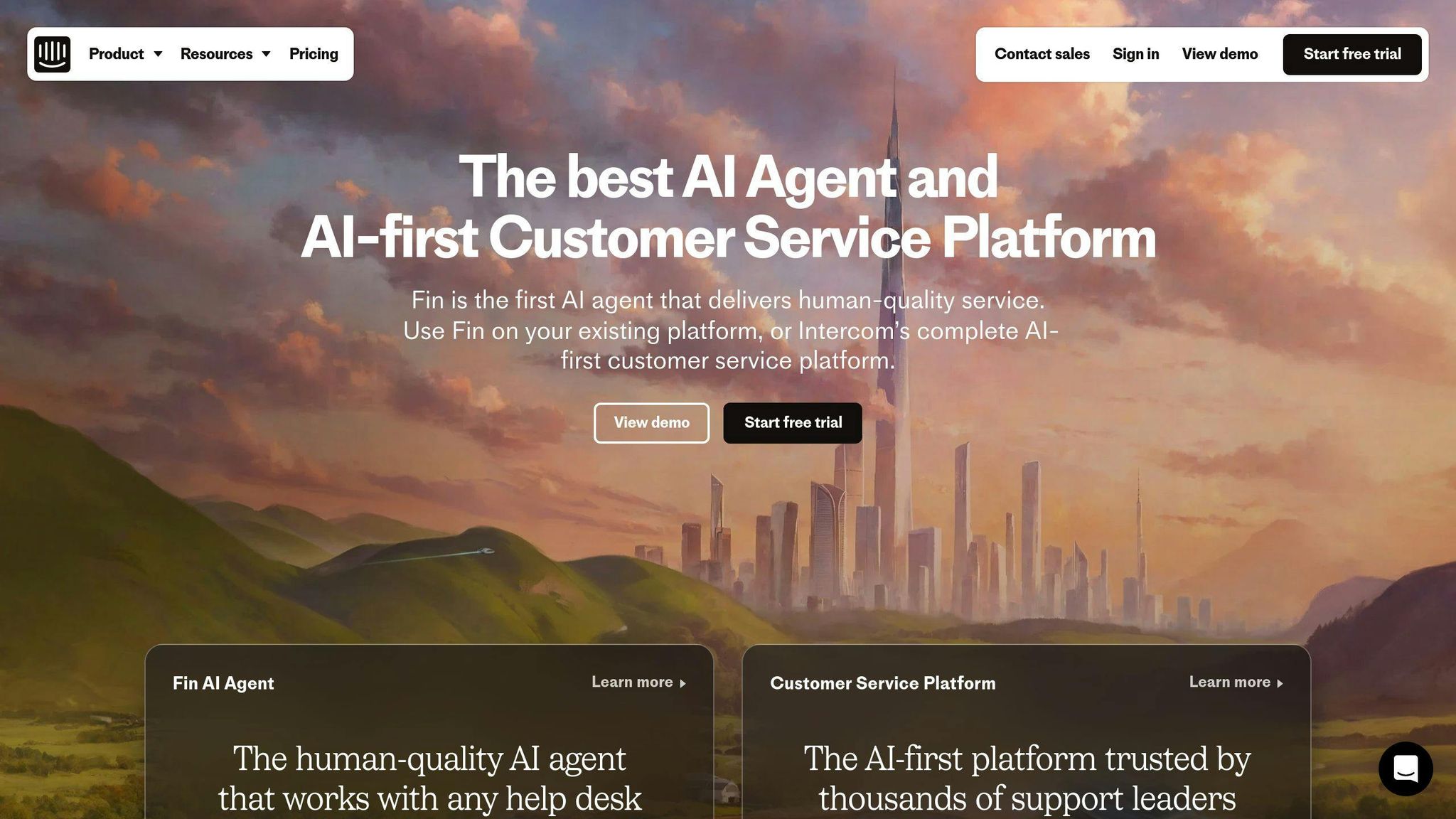
Intercom's lead forms are a game-changer. They've ditched the boring static form for an interactive chat experience. It's like having a real conversation with your website visitors.
Why does it work so well? Let's break it down:
The chat-style form feels personal and engaging. And the numbers don't lie:
- Chat visitors are 82% more likely to become customers
- Their accounts are worth 13% more on average
- One reply can boost conversion by 50%
- 6 messages make a visitor 250% more likely to convert
It's all about creating a dialogue. Matt Hodges, Intercom's VP of Commercial Product Strategy, puts it this way:
"At Intercom the answer to this question informs our entire go-to-market strategy, from the way we position our products, to the audiences we target and the content we produce."
This approach has been a goldmine for Intercom, generating over 100,000 leads through their content marketing efforts.
But it's not just about looking fancy. Intercom's forms are smart:
- They ask one question at a time to keep users focused
- The conversation adapts based on previous answers
- Users get real-time responses, making it feel like a real chat
Intercom also uses this chat-style approach to grab email addresses. Their tip? Offer something valuable in return, like exclusive content or a webinar link.
Need proof it works? Look at Copper, a CRM for Google Apps. They saw a 13% jump in website conversion rate and scored 19 new sales opportunities using Intercom's targeted messaging.
Want to make your own chat-style forms more effective? Here's how:
- Keep initial messages short and snappy
- Use snippets for longer messages to entice users to click and learn more
- Test different formats to see what clicks with your audience
- Use smart chatbots to provide instant, relevant info
The bottom line? Chat-style forms are more than just a pretty face. They're a powerful tool for engaging visitors and turning them into customers.
3. KlientBoost's Clean Layout
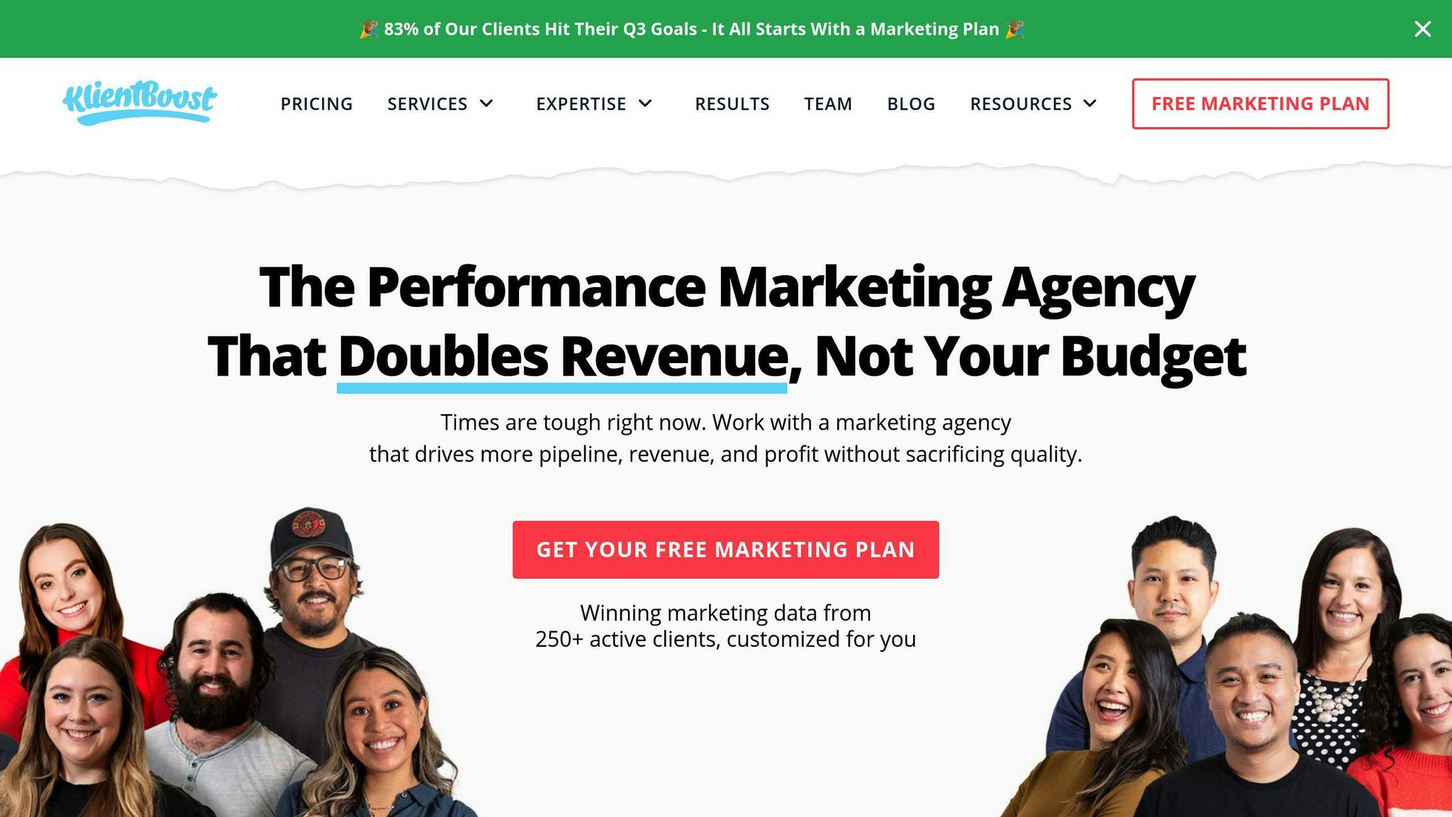
KlientBoost's lead form design is simple yet powerful. They've cracked the code on getting users to actually fill out forms.
The secret? Their "Breadcrumb Technique." It's not rocket science, but it works like a charm.
Here's the deal:
- They split the form into bite-sized steps.
- They start with easy questions.
- They gradually ramp up to the tougher stuff.
Why does this work so well? It's all about psychology:
- Users don't freak out when they see a huge form.
- Once they start, they're more likely to finish.
- A progress bar keeps them in the loop.
And the results? They're pretty wild. One client saw their conversion rate jump by 1485%. That's not a typo.
But KlientBoost isn't just about breaking forms into steps. They're also all about mobile. With most people browsing on their phones, that's a smart move.
Their forms are:
- Single-column (great for scrolling)
- Concise (no unnecessary fields)
- Clear (you know exactly what to enter)
- Progressive (easy questions first, tough ones later)
As KlientBoost puts it:
"We warmed up to the eventual conversion by taking away the anxiety that makes people snub forms in the first place."
It's not just talk. Check out these numbers:
| Form Type | Conversion Rate |
|---|---|
| Single page | 4.53% |
| Multi-page | 13.85% |
That's a 3X boost in conversions. Not too shabby.
So, what can we learn from KlientBoost?
- Break it up. Long forms are scary.
- Show progress. People like to know where they stand.
- Start easy. Build trust before asking for the good stuff.
- Think mobile. Because, duh, it's 2023.
- Keep it lean. Only ask for what you really need.
In short: Make it easy, make it clear, make it step-by-step. That's the KlientBoost way.
4. Lemonade's Step-by-Step Form
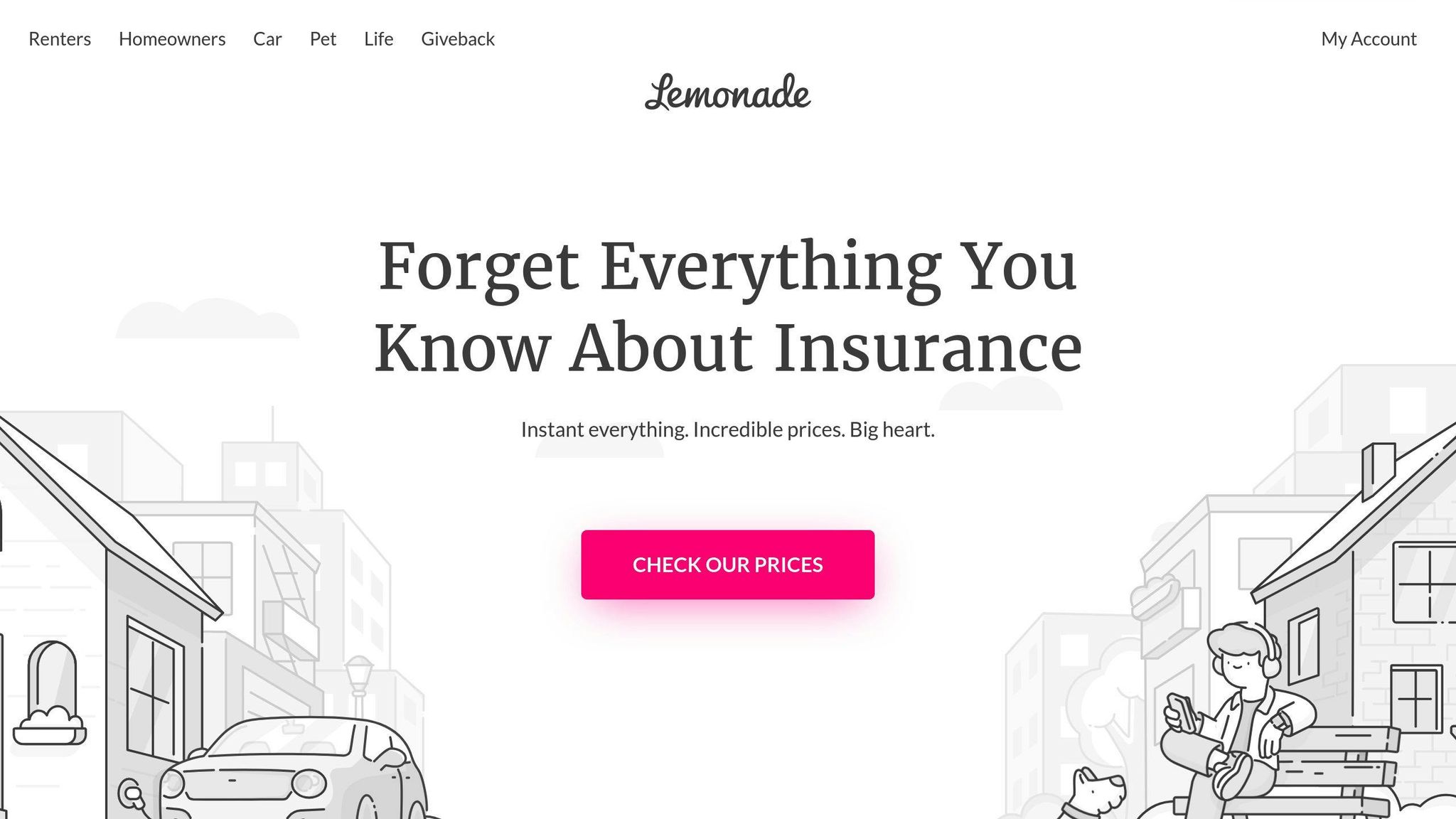
Lemonade's lead form is a game-changer. They've turned the boring insurance sign-up into a smooth chat with AI bot Maya. Let's break down why it works so well:
It's Like Talking to a Friend
Forget clunky forms. Lemonade's chat-style interface feels like texting an insurance buddy. It's personal, not paperwork.
Baby Steps
They slice the sign-up into tiny, easy-to-swallow bites. No overwhelm here. As Juliette van Winden puts it:
"It took me a total of 2 minutes to walk through all the steps with Maya."
Clever Question Order
Lemonade starts soft. Easy questions first, then the trickier stuff. By the time they ask for your email, you're already invested.
Easy on the Eyes
Clean design. Clear text. It's a visual breeze that doesn't make your brain hurt.
Quick Replies
The form talks back. Real-time responses keep you in the loop and show how your answers shape your options.
Phone-Friendly
Lemonade knows you're probably on your phone. Their form plays nice with mobile, using tap-friendly options and fun icons to keep things simple.
Does it work? You bet. While Lemonade keeps their exact numbers close to the chest, similar approaches have seen wild success. Take BrokerNotes - their conversion rate jumped from 11% to 46% with a multi-step form.
Want to Lemonade-ify your forms? Here's how:
- Chop it into steps
- Chat, don't lecture
- Start easy
- Save the personal stuff for later
- Show progress clearly
- Make it work on phones
5. StitchFix's Style Quiz
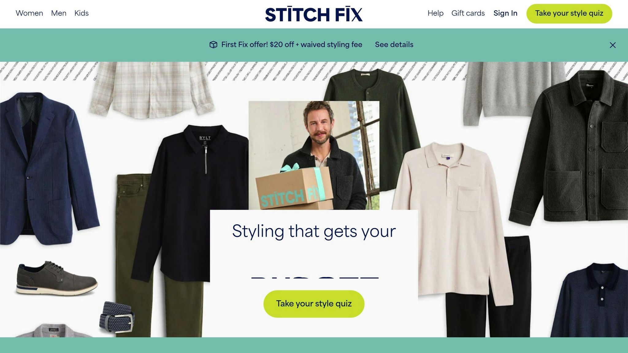
StitchFix's style quiz isn't just a form. It's a personalized shopping experience that turns browsing into a journey tailored just for you.
Why does it work so well? Let's break it down:
It's all about YOU. The quiz digs into your personal style. Size, color preferences - you name it. It makes you feel like StitchFix really gets you.
They don't just ask what you like. They want to know what you DON'T like too. Smart move. It helps them narrow down what you'll love and keeps you happy.
But it's not just guesswork. StitchFix has sent over 100 million "Fixes" (that's their fancy term for personalized clothing selections) to clients. That's a TON of data they use to understand your style.
Here's where it gets cool: They mix AI with human know-how. Their Outfit Creation Model (OCM) whips up millions of outfit combos every day. Then real stylists step in to curate them.
StitchFix puts it like this:
"Through our exclusive Stitch Fix style quiz, we identify your personal combination of up to five style types, delivering a multi-layered style personality."
This approach has helped them gather over 4.5 billion text data points from customers. That's more than all of Wikipedia! Talk about a personalization goldmine.
But the quiz isn't just about data. It's FUN. Take their "Style Shuffle" feature. You swipe through clothes, liking or disliking them. It's addictive, and every swipe teaches StitchFix more about what you dig.
Torunn Skrogstad, Principal Product Designer at StitchFix, says:
"Style Shuffle was a huge unlock for the company. The engagement was higher than what we expected. There was probably something there, so we pulled it onto our own platform."
Want to make your own lead forms pop? Here's what to remember:
- Get personal. Ask questions that show you care about individual likes and dislikes.
- Mix AI and human smarts. Machines are great, but people add that special touch.
- Make it fun. Turn your form into a game. People will engage more and you'll learn more.
- Never stop learning. Use every interaction to get to know your customers better.
6. Blue Apron's Meal Planner
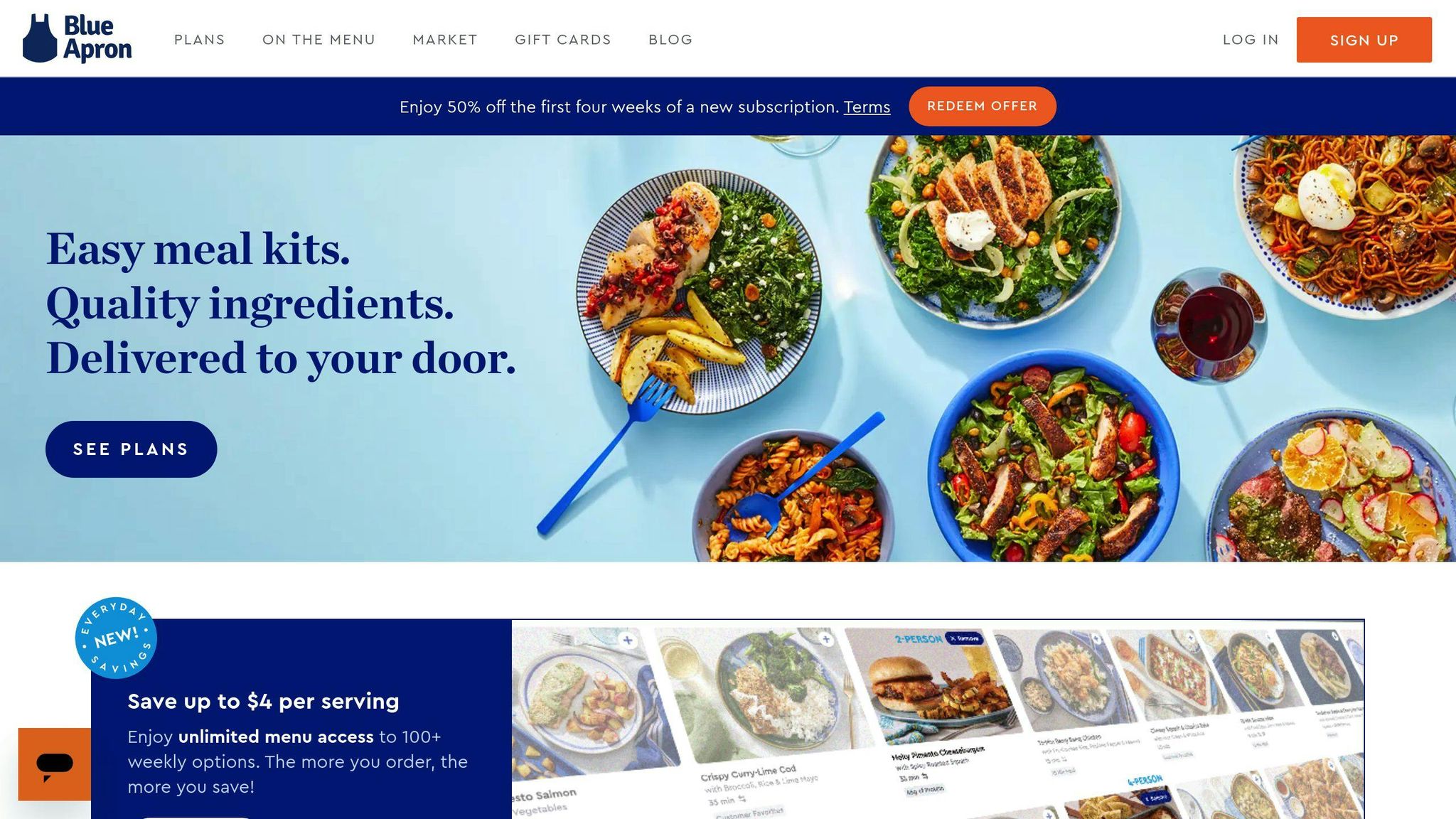
Blue Apron's meal planner is a prime example of turning visitors into customers with a smart lead form. They've turned signing up for meals into a fun, personal experience.
Here's what makes Blue Apron's form so good:
Easy Steps
They split the sign-up into four parts: Welcome, Preferences, Delivery, and Payment. This keeps things simple and keeps users moving forward.
Clear Progress
There's a progress bar at the top. It shows users exactly where they are in the process, which encourages them to finish.
Personal Touch
The form starts by asking for just an email and zip code. As you go on, you can pick your diet needs and meal plans. It feels like it's all about you.
Nice Pictures
Blue Apron uses great photos throughout. You see happy people and yummy food. It helps you picture how good it could be for you.
Answering Questions
At the bottom of each screen, they answer common questions about menus, delivery, and diets. This stops people from worrying and quitting.
Smart Selling
After you buy, they offer wine to go with your meals. It's a clever way to sell more without being pushy.
Does it work? You bet. While Blue Apron keeps their exact numbers secret, similar approaches have worked wonders. BrokerNotes, for example, saw their success rate jump from 11% to 46% with a form like this.
Blue Apron fixed a big problem with their old form, too. One tester had said:
"I don't trust the company right now since it's hiding so much information from me...seems like they're trying to bait and switch me..."
The new design fixes this by being open and informative all the way through, building trust as you go.
Want to use Blue Apron's tricks? Here's how:
- Split your sign-up into clear, easy steps.
- Use a progress bar to show how far people have come.
- Start with easy questions, then get more detailed.
- Use great pictures that show off your product.
- Answer possible worries throughout the process.
- Think about offering extras after the main purchase.
7. Blume's User-First Design
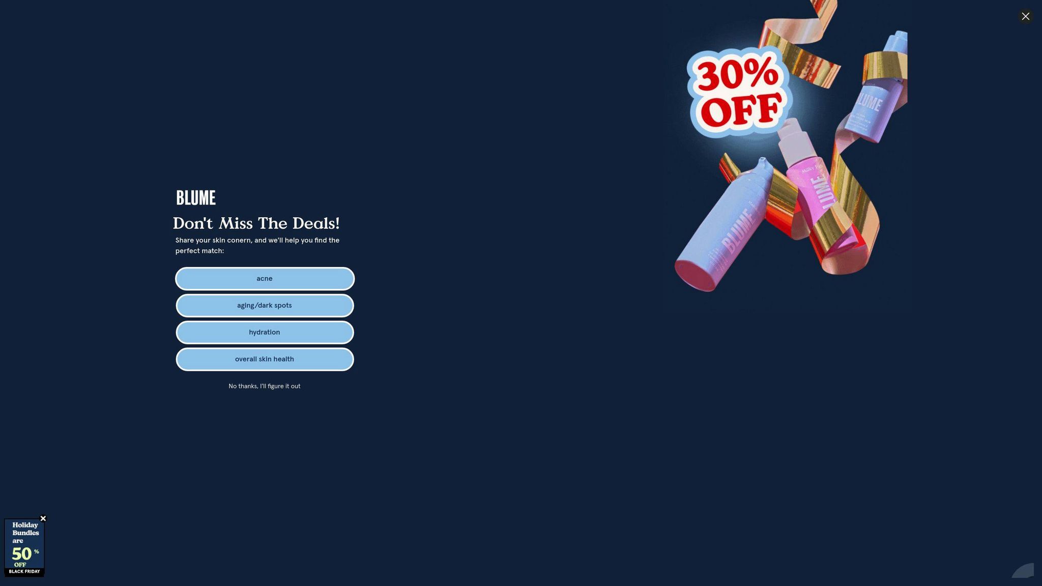
Blume, a wellness brand for women, nails user-first design in their lead forms. They're not just collecting info - they're creating an experience that clicks with their audience.
The Ghatrora sisters, Bunny and Taran, founded Blume with a clear goal: make buying period products online less of a hassle for young women. This insight? It's the backbone of their form design.
Blume's forms feel like a chat with a friend. They don't ask boring questions. Instead, they dig into what really matters. Acne issues? Dry skin? Blume wants to know, making users feel like the brand gets them.
And boy, does it work. Using Wisepops for popups, Blume hit a 5% conversion rate. That's way above average. But here's the kicker: mobile crushed it.
| Platform | Results |
|---|---|
| Mobile | 600 more email signups than desktop |
| Mobile | 50.8% click-through rate |
These numbers show Blume knows their audience inside and out.
Bunny Ghatrora, co-founder, breaks it down:
"We chose Wisepops because of: a) Simplicity of A/B tests, b) Easy integration with Shopify, Zapier, and Klaviyo, and c) Email and phone number collection in one campaign."
It's all about keeping things simple and smooth for the user.
Blume keeps their forms fresh, too. They switch things up based on what users do and what they're aiming for. Like swapping their usual new visitor discount for a "buy-two-get-one-free" birthday deal one weekend.
What can we learn from Blume?
- Know your audience. Blume's success comes from really getting their customers.
- Keep it simple. By working with tools like Shopify and Klaviyo, Blume makes sure users don't hit snags.
- Think mobile-first. More signups on mobile? That's a clear sign to focus on smaller screens.
- Stay flexible. Blume tweaks their forms to match their goals, keeping things interesting for users.
8. Overstockart's Art Finder
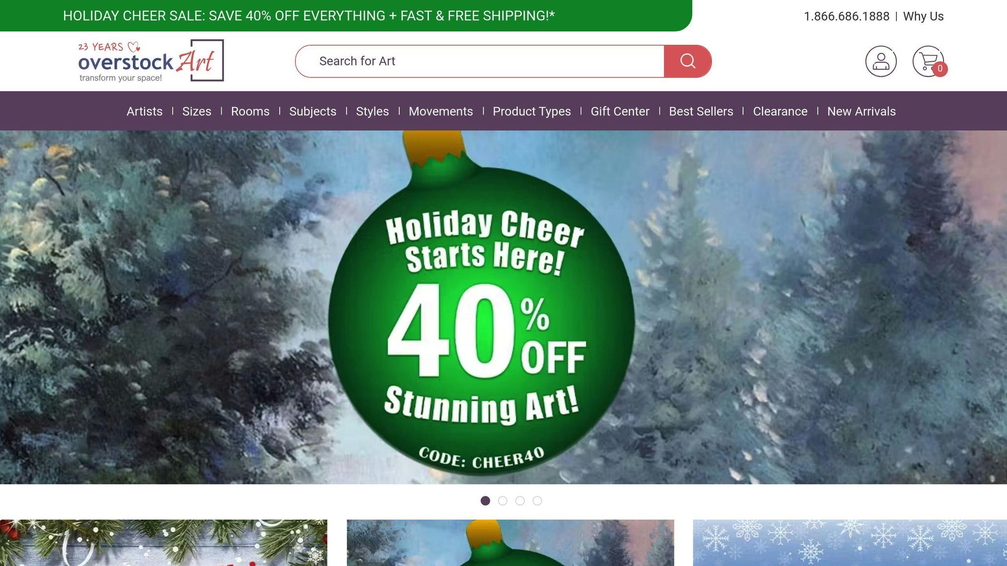
Overstockart's Art Finder shows how to turn browsing into buying. This online art retailer has cracked the code on helping users find their perfect piece.
Overstockart's approach? It's all about personalization. They've built a system that feels like having a personal art curator right there with you. Here's the scoop:
AI-Powered Recommendations
Overstockart teamed up with Barilliance to bring AI into the mix. This tech tracks what you're looking at and suggests art that matches your taste. It's like having a friend who just gets your style.
And the results? They're pretty sweet. Amitai Sasson, VP of eCommerce at Overstockart, says:
"We were looking for a solution to make our website smarter. This is why we turned to Barilliance, using Artificial Intelligence and Machine Learning to give customers the art pieces they will want."
This move paid off big time. Overstockart saw their online conversion rate jump by 11.7%. That's a lot more art finding new homes.
Augmented Reality: See It Before You Buy It
But Overstockart didn't stop there. They created an AR app that lets you see how a piece of art would look on your own wall. Just point your phone camera, and boom! It's like having a virtual art gallery in your living room.
David Sasson, co-founder and president of Overstockart, explains:
"You can put it in front of your wall, you can move the painting around, you can change paintings. The thought behind it was, 'How can we make your experience better than going to a gallery?'"
This tech isn't just cool - it's turning browsers into buyers. As David notes, "The conversion rates from the app are extremely high."
Simple Lead Forms That Work
Overstockart's lead capture forms? They're simple but effective. They use exit-intent popups offering a $100 coupon on a $200+ purchase. It's a smart way to turn window shoppers into email subscribers and, eventually, customers.
The numbers tell the story:
| Metric | Result |
|---|---|
| Peak new leads (May 2020) | 3,800+ |
| Average monthly leads | 1,000 |
| Popup click-through rates | 10.92% - 54.55% |
Amitai Sasson puts it simply:
"Using popups to get emails keeps paying overstockArt.com dividends in 2021."
What Can We Learn From Overstockart?
- Use AI to personalize what you show customers
- Give customers new ways to see your products (like AR)
- Keep your lead forms simple but tempting
- Always be testing and tweaking
Overstockart shows us that when you combine smart tech with a deep understanding of what customers want, you can create an online shopping experience that's hard to resist.
sbb-itb-645e3f7
9. Thrillist's Interest Form
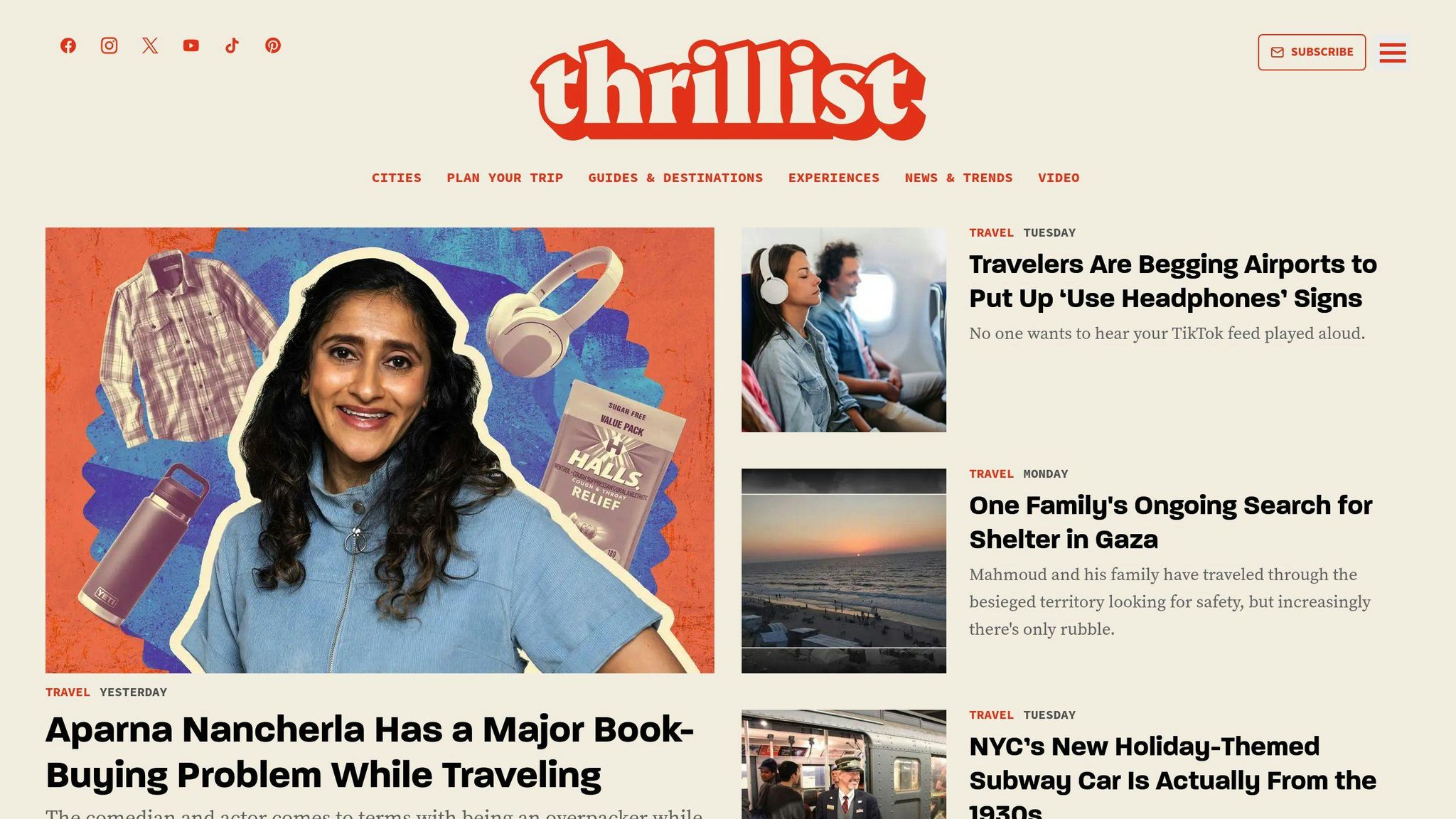
Thrillist, the digital media giant, has cracked the code on understanding their audience. How? With a smart interest form that's more than just a data grab - it's their secret weapon for delivering content that hits the mark.
Here's the scoop on Thrillist's approach:
They Ask, You Tell
Thrillist doesn't play guessing games. They straight-up ask what you're into. Want local events? Travel deals? Just tick the box. It's that simple.
Quick and Painless
No one likes a form that feels like a job application. Thrillist keeps it short and sweet. They focus on what matters - your interests - and nothing else.
What's In It For You?
Thrillist lays it out plain and simple. Take their "Before You Go" newsletter. They promise "travel news, hacks, myth-busting, and flight deals to help you become a smarter traveler." You know exactly what you're signing up for.
Smart Content, Happy Readers
By crunching the numbers from these forms, Thrillist knows what content to create. It's not rocket science, but it works. They've seen big gains, especially in mobile engagement through AMP (Accelerated Mobile Pages).
While Thrillist keeps their exact stats under wraps, their ongoing success speaks volumes.
Want to take a page from Thrillist's playbook? Here's what to do:
- Ask straight questions: Don't beat around the bush. Ask people what they want.
- Keep it easy: If your form feels like work, people won't bother.
- Deliver the goods: Once you know what folks want, give it to them.
- Use your data: Regularly check what your forms are telling you. Use that info to make your content better.
10. Dropbox's Business Form
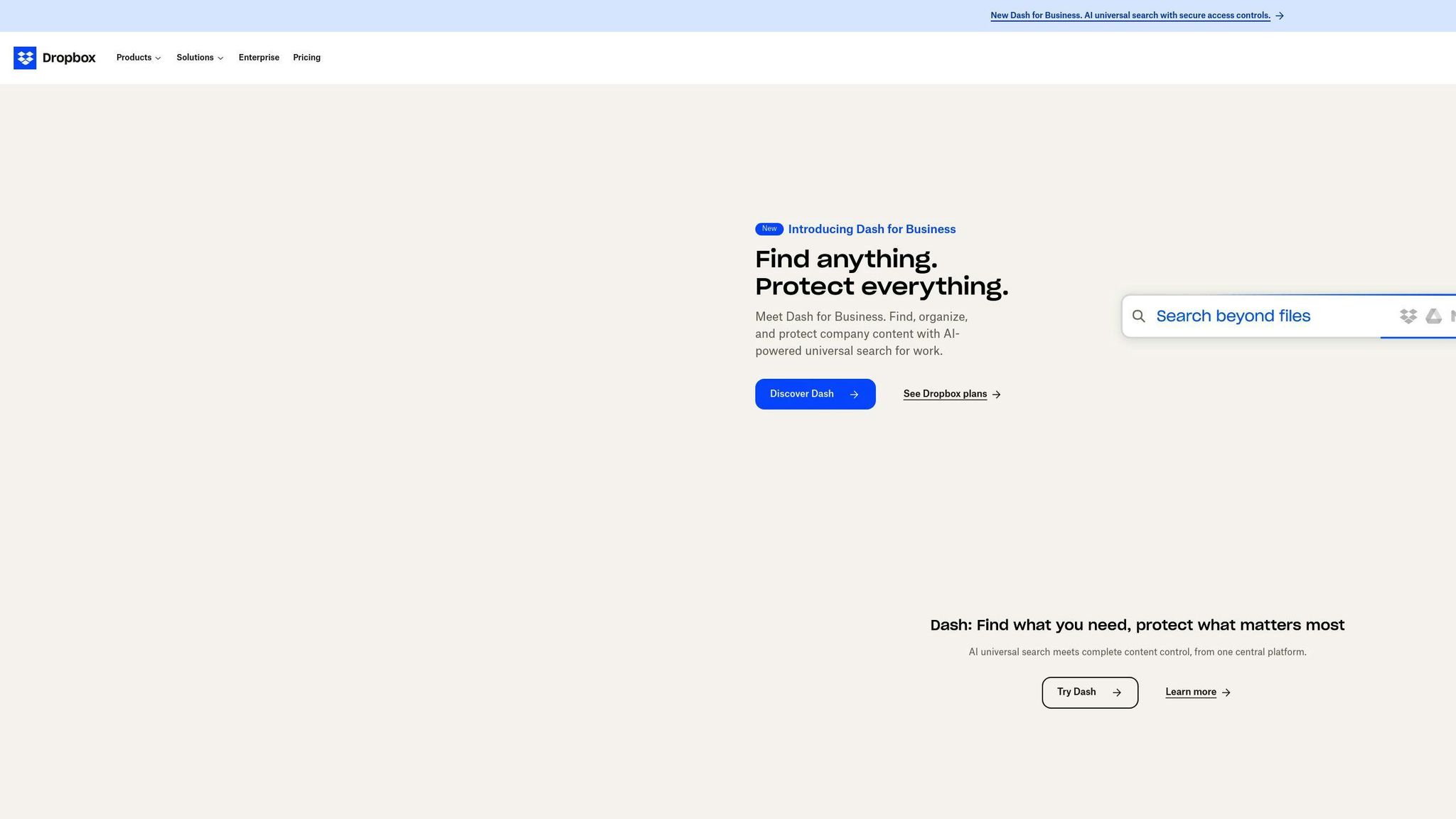
Dropbox's business form is a prime example of simplicity meeting effectiveness. They've mastered the art of converting free users to paying customers with a form that's both user-friendly and data-rich.
The secret sauce? Personalization. Dropbox doesn't use a one-size-fits-all approach. They tailor the experience based on what they know about you. Brian O'Sullivan, Senior Growth Marketing Manager for Dropbox, puts it this way:
"Humans are essentially all the same. One thing they have in common is they all think they're different."
This insight shapes their form design. They ask just enough questions to make you feel understood, without bombarding you with a lengthy questionnaire.
But here's the kicker: Dropbox doesn't wait for you to fill out a form to start learning about you. They observe how you use their product and use that info to guide their outreach. It's like they're reading your mind, but in a good way.
A former Dropbox growth team member reveals:
"Our growth team had a rich set of user segmentation criteria based on product usage around specific features. They used the output for highly targeted and personalized outreach campaigns."
This approach isn't just clever - it's effective. By focusing on specific usage signals, Dropbox can create marketing campaigns that speak directly to what different users need. It's like having a salesperson who already knows what you want before you even ask.
Dropbox doesn't just collect data; they use it to improve their product. Features like shared folders and their referral program came from understanding how people actually use Dropbox. These features don't just enhance the product - they turn users into brand advocates.
Take their referral program, for instance. Users got 500 megabytes of free space for each friend they invited. Suddenly, everyone was telling their friends about Dropbox. It's a perfect example of how smart form design and user understanding can drive growth.
Dropbox's success isn't just about fancy tech. It's about understanding people. They know that a business choosing a cloud storage solution isn't just making a tech decision - it's trusting someone with their most valuable asset: their work.
Andrew Jones, CEO of Agility in Mind, explains:
"Team members sometimes spend days or even weeks creating a new product, so we need a platform that backs it up instantly. We use Dropbox because it means we'll never lose our greatest asset: our intellectual property."
This understanding shapes every aspect of their forms and outreach. They're not just collecting data - they're building trust.
So, what can we learn from Dropbox's approach?
- Use what you know: Don't ask users for info you should already have. Use their behavior to personalize your forms.
- Keep it simple: Ask only what you need to know. Every extra field is a chance for someone to bail.
- Make it worthwhile: Give users a reason to share their info. Whether it's more storage or better features, make sure there's something in it for them.
- Think beyond the form: Your lead capture strategy should be part of your product. Features that encourage sharing can be your best lead generation tools.
- Build trust: Remember, you're not just collecting data - you're starting a relationship. Make sure every interaction builds confidence in your brand.
11. CrazyEgg's Free Trial Form
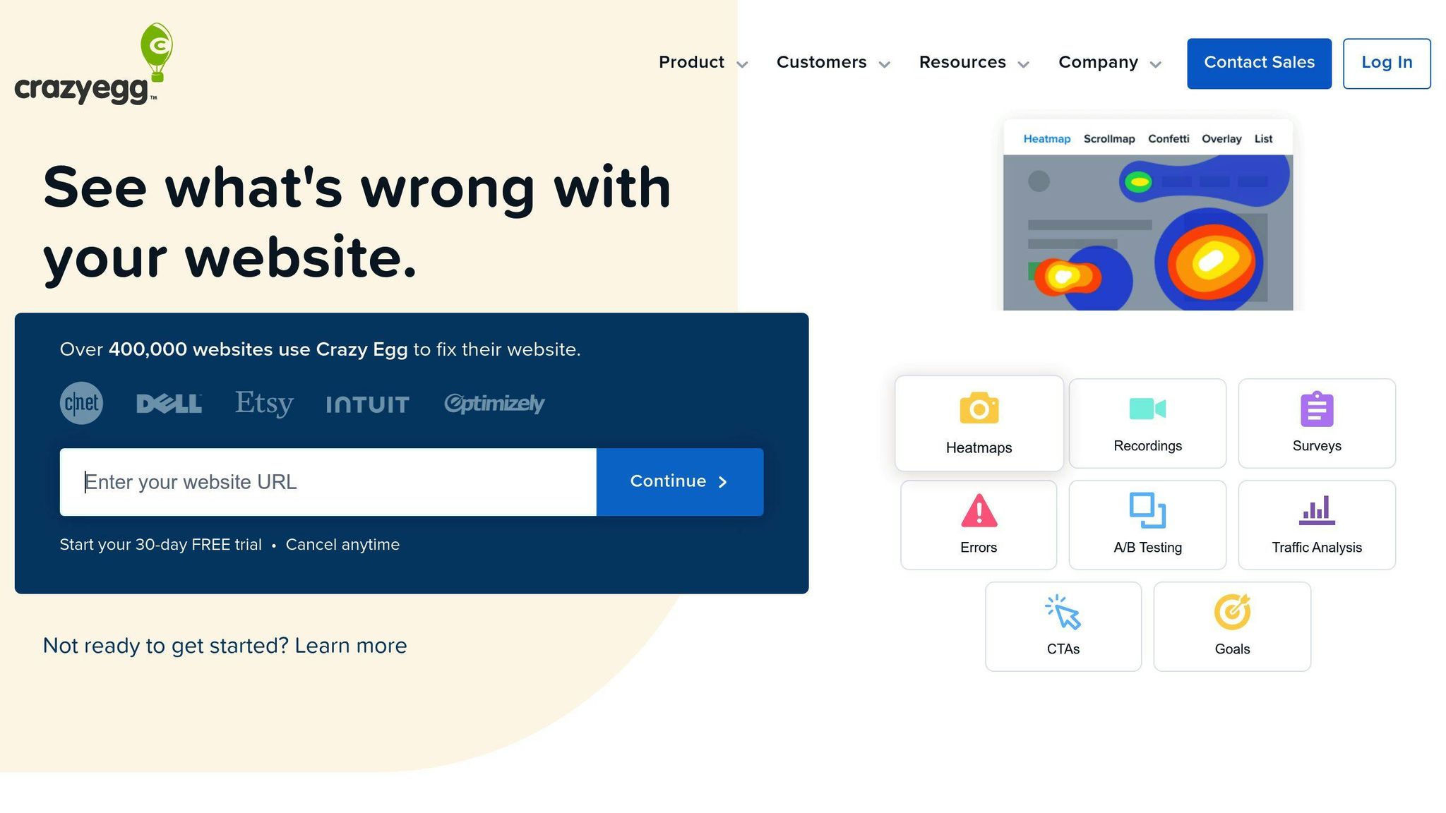
CrazyEgg nails free trial signups with a no-nonsense approach. They've cut the fluff and zeroed in on what matters: getting users to try their product, fast.
Their homepage is a prime example. It features just three options: Log in, Read more, and Sign up. This clean design has boosted their conversions big time.
What's CrazyEgg's secret sauce? They get that sometimes, less is more. While others cram their pages with buttons, CrazyEgg keeps it simple. Their signup form? It usually asks for one thing: a website URL. That's it. It's quick, easy, and right on point for what they offer.
But CrazyEgg doesn't stop there. They've fine-tuned every part of signing up:
- The headline shouts "free trial" right off the bat
- Users can sign up with email or Google
- Different colored buttons guide you through
- Real client testimonials build trust
We don't know CrazyEgg's exact numbers, but in the industry, a solid free trial form can turn 10-20% of users into paying customers.
Wes Bush, a SaaS expert, puts it this way:
"If you've taken a look at Crazy Egg's homepage, it is a bit crazy. They've stripped out the non-essential items and optimized for only three action items."
This isn't just about looking good - it's smart psychology. By keeping things simple, CrazyEgg makes it easy for users to jump in and try their product.
Want to up your lead generation game? Take a page from CrazyEgg's book:
- Cut your form down to the basics. Every extra field is a chance for users to bail.
- Show users what they're getting and why it matters.
- Make sure your form works well on phones. It's 2023, after all.
- Keep testing and tweaking based on user feedback.
12. Content and Marketing's Tool Search
Content and Marketing's tool search is a smart way to get leads. It's a big directory where marketers can find tools they need. And while they're searching, the site gets useful info about them.
The search form? It's simple. But it works great. Users can filter through tons of marketing tools fast. It's easy to use, just like forms on HubSpot or Lemonade.
Here's what's cool: Content and Marketing doesn't ask for your email right away. Instead, they let you look around first. Find some useful stuff. Then you're more likely to share your info later.
What can you search for? All kinds of things:
- AI for writing blogs
- Managing social media
- Handling influencers and PR
- Making videos
- Sending out press releases
It's got something for everyone in marketing.
Now, we don't know exactly how well it converts. But it's doing things right. Take Dropbox, for example. They got great results by personalizing their forms. Content and Marketing does something similar - they make things relevant based on what you search for.
Want to make a tool search like this? Here's how:
- Keep it simple at first. Don't ask for too much info.
- Use clear categories. Make it easy to find stuff.
- Give lots of details about each tool. Make it worth their time.
- Use what you learn from searches to make your follow-ups better.
13. LeadFormly's Smart Fields
LeadFormly's smart fields take lead forms up a notch. They adapt based on user input, creating a personalized experience for potential leads.
Here's why LeadFormly's smart fields stand out:
They're Dynamic
The forms change as you fill them out. Only relevant questions pop up, keeping things short and boosting completion rates.
They Use Progressive Profiling
Instead of hitting visitors with a ton of questions at once, LeadFormly takes it slow. It's like a chat - you start with the basics, then dig deeper over time. This approach can boost conversions by making forms less scary.
They're Mobile-Friendly
LeadFormly knows people use phones. Their smart forms can show shorter versions for mobile users. One company saw their mobile leads jump 5x in just two weeks after using this feature.
They Speak Your Language
Smart fields can adapt to where you are. Forms can show up in the right language based on your location. It's a small thing that can make a big difference if you're selling worldwide.
They Grow With Your Leads
As leads move through your sales funnel, the forms change. Here's how it might look:
1. First Contact: "What's your budget range?"
2. Marketing Qualified Lead: "When do you want to start your project?"
3. Sales Qualified Lead: "Who makes the final decision in your company?"
This way, you're always asking the right questions at the right time.
Real-World Example
Let's say you run a landscaping business. Your first form might ask about yard size and general needs. For people who come back, you could ask about specific plants they like or if they need sprinklers.
"These ideas are just a few of the ways you can increase conversions by providing a more relevant experience for visitors."
The trick is to keep it simple. Start with basic questions, then use smart fields to learn more bit by bit. This makes filling out forms feel less like work and more like a helpful conversation.
14. OddBalls' Fun Form Design
OddBalls, a quirky underwear brand, turns boring lead forms into exciting games. Their approach? Make forms fun to boost engagement and conversions.
How do they do it? By tapping into our love for games and competition. Their standout example: a "Wheel of Fortune" style quiz. To play, visitors fill out a lead gen form first. Clever, right?
Yash Suresh from Juniper Networks (who tried something similar) says:
"We found that quizzes were a lot more effective than just telling attendees, 'Hey, fill in my form, and I'll give you a free gift.'"
But OddBalls doesn't stop at quizzes. They use:
- Progress bars
- Fun animations
- Rewards (like discounts or free stuff)
Why does this work? It's memorable, reduces form abandonment, fits their brand, and gets better data. People actually WANT to fill out these forms!
Want to try this yourself? Here's how:
- Keep it short (don't overdo it)
- Match the game to your brand
- Offer something worthwhile
- Keep improving based on feedback
While OddBalls keeps their exact numbers secret, similar approaches have seen big wins. Gamified surveys often get way more responses and better info.
So, next time you're designing a form, think: How can I make this FUN?
15. ClickMechanic's Car Service Form
ClickMechanic's car service form shows how to match users with services fast. They've made booking car repairs and maintenance a breeze for customers and mechanics alike.
The form is simple but gets the job done. It asks for key info up front, cutting down on back-and-forth later. This approach has worked wonders for ClickMechanic's conversion rates.
What makes their form tick?
Smart Questions: The form changes based on what you input, showing only what's needed. This keeps things short and sweet, so more people finish it.
Mobile-Ready: ClickMechanic knows people book on the go. Their form works great on all devices, letting users book from anywhere.
Clear Benefits: The form tells you right away why ClickMechanic is worth your time. This builds trust and keeps users moving through the booking process.
The results? Pretty impressive. ClickMechanic saw a 20% jump in conversions after tweaking their form. While we don't know the exact tools they used, this growth lines up with what you'd expect from a well-designed lead form.
Let's break down some numbers:
| Metric | Result |
|---|---|
| Conversion Boost | 20% |
| Quick Response Impact | 391% more lead conversions when responding in the first minute |
| First to Respond Advantage | 78% of leads buy from the first business to get back to them |
These stats show it's not just about the form - quick follow-up matters too. ClickMechanic's form likely has features that help them respond to users fast.
Want to up your lead form game? Try these tips inspired by ClickMechanic:
- Keep it short: Ask only what you need to avoid people dropping off.
- Make it mobile-friendly: Your form should look and work great on phones and tablets.
- Use smart fields: Show only relevant questions based on previous answers.
- Show the benefits: Make it clear why users should choose your service.
- Respond quickly: Set up a system to get back to leads fast, ideally within an hour.
Tips for Better Forms
Looking to improve your form conversions? Let’s break down some strategies that are proven to work. Research shows that fine-tuning your form design can lead to conversion rate increases of up to 50%.
Simplify Everything
Forms with fewer fields tend to perform better. For instance, HubSpot streamlined their contact form to just three essential fields and saw a 30% jump in conversions. The lesson? Only ask for what you absolutely need.
Design for Every Device
Mobile-friendly forms aren't negotiable anymore. They should look great and work smoothly no matter what device people use. Responsive design is mandatory - with touch-friendly inputs and buttons at least 44 pixels tall to make things easy.
Here’s what high-performing forms consistently include:
| Feature | Impact on Conversion |
|---|---|
| Clear Error Messages | +25% completion rate |
| Autofill Support | +35% faster completion |
| Progress Indicators | +28% form submissions |
| Smart Validation | -40% form abandonment |
Tackle Errors the Right Way
Place error messages directly beside the issue - don’t make users hunt for them at the top or bottom of the form. KlientBoost’s inline validation strategy reduced their form abandonment rate by 45%. Their key? User-friendly error messages that explain exactly how to fix problems.
Optimize for Speed
If your forms load slowly, your conversions will suffer. Boost your form's speed by:
- Minimizing JavaScript usage.
- Using efficient validation processes.
- Breaking long forms into faster-loading multi-step sections.
Make Fields Smarter
Conditional logic is your secret weapon. Show users only the fields that matter based on their prior answers. Growform has shown this method can cut form length in half while keeping lead quality intact.
"Multi-step forms have shown a 300% increase in conversion rates compared to single-page forms when implemented correctly", notes Trustmary's research team.
Break it Into Sections
Don’t overwhelm users - use clear visual separations to make your forms more approachable. Group related fields together, add clear headings, and leave enough white space so the form doesn’t feel like an endless chore.
Pro Tip for Consistency
Make sure the messaging around your form matches the form itself. If your headline promises a free trial, reflect this in your form’s button text - like "Start My Free Trial." Consistency like this has been shown to raise conversion rates by up to 40%.
And don’t forget to continuously test! Run A/B experiments on layouts, field order, and call-to-action buttons to see what resonates most with your audience. Small tweaks can lead to surprising results.
How to Check Form Success
To truly measure how well your forms are working, you need to look at specific metrics that show both how many people are submitting and how valuable those submissions are. Research shows that well-designed forms can hit conversion rates as high as 25%, whereas the usual range falls between 2-5%.
Key Metrics to Watch
To track success, focus on three main areas. First, measure your conversion rate, which tells you the percentage of visitors completing your form. Next, study form abandonment to see where users lose interest or get stuck. Finally, assess lead quality by determining how many submissions actually lead to meaningful opportunities.
Here’s a handy table to help understand the key metrics and what their numbers might mean:
| Metric | Strong Performance | Warning Signs | Needs Immediate Action |
|---|---|---|---|
| Conversion Rate | >15% | 5-15% | <5% |
| Completion Time | <45 seconds | 45-90 seconds | >90 seconds |
| Abandonment Rate | <40% | 40-60% | >60% |
| Error Rate | <10% | 10-20% | >20% |
Testing for Improvement
Begin by using tools like Growform to get a clear baseline of your form’s performance. Change only one element at a time, such as field order, the length of the form, or button text, so you can pinpoint what works. Make sure to test for at least two weeks or gather 1,000 submissions to get reliable data.
Pro Tips for Testing Smarter:
- Experiment during less busy hours to avoid heavily affecting your conversions.
- Compare how users interact with your form on desktops versus mobile devices.
- Keep an eye on loading speeds - forms that take over 3 seconds to load can seriously hurt completion rates.
- Track how often error messages appear to spot fields that need fixing.
“Multi-step forms that guide users through the process and sort leads by their responses hit a 47% higher completion rate than single-page forms,” says Growform’s recent report on conversions.
Focus on Quality, Not Just Numbers
High submission counts are great, but they don’t mean much if the leads aren’t worth pursuing. Make sure you’re tracking these lead quality indicators:
- Sales qualification rates to find strong prospects.
- Average deal size to understand revenue potential.
- Time from submission to conversion to spot bottlenecks.
- Customer lifetime value (CLV) based on where the lead came from.
Wrap-Up
Creating lead forms that work well isn’t just about getting info - it’s about crafting a smooth experience that turns visitors into leads. From looking at different form designs, it’s clear that keeping things simple and focusing on the user leads to better results.
The best-performing forms often share a few key traits. For example, HubSpot’s contact form shows how asking only for essential information can push more people to fill it out. On the other hand, KlientBoost has found success with multi-step forms that break the process into manageable parts, making it less intimidating.
"Multi-step forms that guide users through the process and sort leads by their responses hit a 47% higher completion rate than single-page forms", according to recent conversion research.
If you're designing your own forms, focus on what works:
| Design Element | Impact on Conversion | Implementation Tip |
|---|---|---|
| Form Length | 25% rise with fewer fields | Stick to the must-haves only |
| Visual Layout | 15% boost with tidy spacing | Use white space to avoid clutter |
| CTA Clarity | 35% jump with clear buttons | Swap "Submit" for action-focused phrases |
Tools like Growform and Trustmary can make this process a breeze. Their templates are crafted to encourage users to complete forms while keeping things professional and easy to navigate.
Keep in mind that successful forms aren’t a one-time deal - they need consistent testing and tweaking. Pay close attention to your form's performance data and make adjustments based on what works. Your goal: collect the info you need while making the process as easy as possible for the user.
Key Takeaway: Great lead forms are simple but thoughtfully designed to guide users step by step. Whether you choose a multi-step format or keep it super streamlined, always focus on creating a user-friendly experience while achieving your business goals.
FAQs
What are the best forms for lead generation?
The most successful lead generation forms strike a balance between simplicity and smart design. According to recent insights from GetLeadForms, multi-step forms tend to outperform others, boasting up to 47% higher completion rates compared to traditional one-page forms.
Here's a breakdown of effective form types:
| Form Type | Best Use Case | Key Benefit |
|---|---|---|
| Multi-step Forms | For complex services | 35% higher completion rate |
| Chat-style Forms | Encouraging engagement | 28% better user experience |
| Quiz-based Forms | Product suggestions | 42% better lead quality |
"When we implemented segmented multi-step forms at SnackNation, we saw a 54% increase in qualified leads and significantly improved our sales team's ability to personalize follow-up communications", shared their lead generation team.
So, what do top-performing forms have in common?
- They keep fields minimal - around 3-5 for the initial contact.
- Include clear, action-driven CTAs.
- Work flawlessly on mobile devices.
- Personalize follow-ups based on user input.
B2B services benefit the most from contact forms that include fields tailored to business needs. Meanwhile, e-commerce brands tend to see better results with quiz-style forms that help users discover products suited to their preferences. The trick? Match the form design to your audience while keeping things simple and easy to use.
